
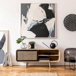
 Large wall art succeeds when it feels connected to the room rather than added after the fact. Before considering color, subject matter, or artistic style, study the architecture that will surround the piece. Ceiling height, wall width, window placement, built-in cabinetry, fireplaces, and doorways all influence how large an artwork can comfortably become. A broad uninterrupted wall can support a commanding horizontal canvas, while a narrow wall between windows may call for a tall vertical work. Rooms with vaulted ceilings can absorb more visual scale than compact spaces with low ceilings and dense furniture arrangements. Treating the architecture as the first design constraint helps prevent a piece from appearing either insignificant or overpowering.
The shape of the wall is often as important as its square footage. A long wall above a sectional sofa usually benefits from artwork that emphasizes width, because the horizontal line reinforces the furniture below it. A tall wall beside a fireplace may look more balanced with an elongated vertical composition that draws the eye upward. Square artwork can be effective on contained walls where symmetry already plays a strong role, particularly between matching lamps, windows, or architectural details. In open-plan homes, a large artwork can also serve as a visual boundary that defines the living area without requiring a physical divider. That function makes wall art part of the room's architecture, even though it is technically decoration.
Negative space deserves equal attention because large artwork needs room around it to register clearly. Filling every available inch of a wall can make even an expensive piece feel crowded and visually restless. Leaving intentional space around the artwork creates separation from moldings, furniture, sconces, and nearby decorative objects. This breathing room becomes especially important in minimalist, contemporary, and formal interiors, where each element is expected to carry more visual responsibility. Traditional and eclectic rooms may tolerate closer layering, but the artwork should still have a recognizable boundary around it. The best starting point is therefore not asking how much wall can be covered, but how much art the room can support while retaining visual balance.
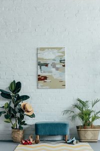
Scale is one of the most consequential decisions in choosing large living room art because furniture establishes the visual weight that artwork must answer. A substantial sofa placed beneath a small picture often makes the art seem accidental, regardless of its quality. As a practical guideline, artwork positioned above a sofa often looks most convincing when its width occupies roughly two-thirds to three-quarters of the furniture below it. That proportion is not an inflexible rule, but it provides a reliable reference when evaluating larger pieces. Oversized art can exceed that range when the design is deliberately dramatic, particularly in contemporary rooms with restrained furnishings. What matters most is that the artwork and furniture appear to belong to the same visual composition.
Once homeowners have a rough size and orientation in mind, the search becomes less about finding attractive art and more about identifying pieces that work at living-room scale. Browsing by dimensions, format, and placement can be more useful than starting with subject matter. Broad marketplaces can also make it easier to compare how materials and proportions affect a piece’s presence on a large wall. iCanvas, an online marketplace, offers ready-to-hang works from independent artists, licensed estates, and cultural institutions across canvas, fine art paper, acrylic glass, wood, and metal. When the main challenge is filling a generous stretch of wall without overwhelming the room, browsing its range of art in larger proportions can help clarify the options, while those furnishing a seating area can narrow the search to art suited to larger living-room walls. This approach keeps proportion and placement central while allowing style and imagery to guide the final selection naturally.
Measurements, however, are only part of the equation. The visual density of the furniture should also influence how substantial the artwork needs to feel. A low-profile cream sofa with slender legs presents less visual weight than a deep leather Chesterfield of identical width. The lighter sofa may pair comfortably with an airy abstract painting, while the heavier sofa may require stronger contrast or a more substantial composition to keep the wall from feeling weak. The same principle applies to coffee tables, bookcases, floor lamps, and side chairs that enter the field of view. When several heavy pieces occupy the lower half of the room, larger artwork can help distribute attention vertically and restore equilibrium. Successful scale is therefore both mathematical and perceptual, combining physical dimensions with the apparent weight of everything nearby.
 Let the Room's Design Language Guide the Subject
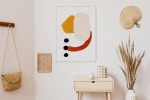
Subject matter has a powerful effect on whether large wall art looks integrated with a living room. A modern interior with clean lines and limited ornament often benefits from abstract work, architectural photography, geometric compositions, or restrained landscapes. Traditional rooms may respond well to botanical studies, portraiture, classical landscapes, or works that carry a sense of history and craftsmanship. Eclectic interiors have more freedom because contrast is often part of the intended character, although seemingly unrelated objects still need common threads. Coastal rooms, for example, do not require literal pictures of beaches, but they may benefit from atmospheric landscapes, soft photography, or abstract work inspired by water and sky. The objective is to support the room's design vocabulary without turning the artwork into a predictable illustration of the decorating theme.
Literal coordination can become a weakness when every decorative element repeats the same idea. A rustic living room filled with timber, woven materials, and natural colors does not necessarily need a painting of a barn or forest. A contemporary room does not automatically require black-and-white geometric abstraction simply because the furniture has sharp edges. More sophisticated interiors often use art to extend the room's emotional character rather than duplicate its objects. A warm minimalist room might gain depth from a muted figurative painting, while an industrial loft could benefit from a soft atmospheric piece that offsets concrete and steel. Thinking in terms of mood, rhythm, texture, and visual tension usually produces a more layered result than choosing art by theme alone.
The emotional tone of a large artwork deserves particular attention because scale magnifies its effect. A small unsettling image can be an intriguing accent, while the same imagery at six feet wide may dominate the emotional atmosphere of the entire room. Conversely, expansive landscapes, expressive abstracts, and quiet monochromatic works can give a living area a powerful sense of calm when reproduced at substantial scale. Consider how often the room is used, who uses it, and what the space is meant to encourage. A formal sitting room can accommodate a more intellectually challenging work than a family room designed primarily for everyday relaxation and conversation. Large art operates almost like background music for the eye, so its emotional register should be chosen with the same care as its dimensions.
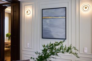
Color matching does not mean finding artwork that reproduces the exact colors of the sofa, rug, and curtains. That approach often creates interiors that feel overly coordinated and visually flat. Instead, large wall art can draw from one or two existing colors while introducing additional tones that make the palette more complex. A neutral living room might benefit from artwork containing warm rust, deep green, or muted blue, provided one of those shades connects naturally with an existing object in the space. Conversely, a colorful room may benefit from quieter artwork that gives the eye a place to rest. The strongest color relationships usually involve repetition, variation, and contrast rather than exact duplication.
Undertones become particularly important when the artwork occupies a large percentage of the visual field. Whites can lean warm, cool, gray, cream, or even slightly green, while ostensibly neutral browns and beiges can carry red, yellow, or gray undertones. A large print with icy blues may feel unexpectedly harsh beside warm ivory upholstery, even if both appear subdued when viewed separately. Similarly, an artwork dominated by warm ochre can make a cool gray wall look bluer than expected. Viewing samples or product images near the furniture and wall color can reveal these interactions before installation. Large art changes how adjacent colors are perceived, which makes undertone compatibility a practical design issue rather than a minor aesthetic detail.
Contrast can be used strategically when a room needs more definition. Light walls can provide an effective background for richly saturated artwork, while darker rooms may gain dimension from pieces with pale areas, reflective surfaces, or high tonal variation. In monochromatic spaces, artwork does not necessarily need to introduce a new hue because contrast can also come from value, texture, or line. A black-and-white photograph, for example, can provide strong visual structure in a beige room without disrupting its neutral palette. Colorful artwork can similarly function as the main source of energy in an otherwise restrained interior. The goal is to decide whether the art should reinforce the existing palette, expand it, or deliberately interrupt it.
The surface on which art is presented affects how the work interacts with the rest of the living room. Canvas tends to provide a softer, more tactile appearance, making it versatile across contemporary, transitional, rustic, coastal, and casual interiors. Fine art paper placed behind a frame can create a more structured presentation that works particularly well in traditional, Scandinavian, gallery-inspired, and modern spaces. Acrylic surfaces often create sharper color, greater visual depth, and a polished finish that can suit sleek contemporary rooms. Metal can reinforce industrial or modern interiors, especially when photographic or graphic imagery is involved. Wood-based art introduces texture and warmth, qualities that may complement organic modern, farmhouse, lodge, or nature-focused spaces.
Finish should also be considered in relation to the room's existing materials. A living room already filled with polished stone, glass tables, and metallic fixtures may not need another highly reflective surface. A textured canvas could provide useful softness and prevent the space from appearing too slick. In contrast, a room dominated by linen, unfinished timber, boucle, and other matte materials might benefit from an acrylic or metal piece that introduces subtle visual precision. Repetition can create cohesion, but variation is what keeps a sophisticated room from becoming monotonous. Good material selection therefore balances compatibility with enough contrast to give the artwork a distinct presence.
Frames can significantly alter the character of large art, particularly because their thickness becomes more noticeable as dimensions increase. Thin black frames can lend structure to contemporary photography, posters, and abstract prints without demanding excessive attention. Natural wood frames can soften modern artwork and establish connections with flooring, cabinetry, or furniture. Ornate frames may strengthen the historical or formal character of traditional interiors, but they should be proportional to both the artwork and surrounding furnishings. Frameless canvas presentations often create a cleaner, less architectural appearance, allowing the image itself to dominate. The frame is not merely an accessory around the art; it is part of the transition between the artwork and the room.
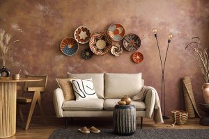
Placement is often discussed as a question of hanging height, but successful positioning requires looking at the complete seating arrangement. Artwork above a sofa should typically appear visually connected to the furniture rather than floating near the ceiling. A common mistake is leaving so much space between the sofa and artwork that they read as unrelated elements. In many rooms, placing the lower edge of the artwork roughly six to twelve inches above the sofa provides a useful starting range, although furniture height and artwork dimensions can justify adjustments. The center of the art does not always need to correspond with generic gallery-height recommendations if the piece is anchored to furniture. Residential placement works best when relationships between objects take priority over universal numbers.
Centering also requires judgment because the architectural center of a wall may differ from the visual center of a furniture grouping. If a sectional extends farther on one side, artwork centered on the wall can appear misaligned with the seating area. Likewise, a sofa positioned off-center because of a doorway or fireplace may require the art to follow the furniture rather than the room itself. Floor lamps, side tables, consoles, and adjacent chairs can shift the perceived center of the composition. Photographing the wall straight on can make these imbalances easier to identify than viewing the space while standing inside it. The correct position is the one that makes the group feel balanced as a whole.
Large art can also be positioned away from the sofa entirely, especially in living rooms with multiple focal points. An oversized piece on the wall opposite the seating area can create a destination for the eye and prevent the television from becoming the room's only dominant feature. Artwork beside a fireplace can help balance a chimney breast when there is enough uninterrupted wall space. In open-concept homes, a commanding artwork on a dining-adjacent or entry-facing wall may visually announce where the living room begins. These placements are particularly effective when the art can be seen from several parts of the home. Thinking about sightlines expands the role of large artwork from wall decoration to a tool for directing movement and attention.
 Adapt the Choice to Specific Interior Styles
Modern and contemporary living rooms generally reward clarity, scale, and restraint. Large abstract works, architectural photography, minimalist landscapes, and graphic compositions can reinforce the clean geometry commonly found in these spaces. A single substantial piece often works better than a crowded arrangement because it preserves the visual simplicity of the room. Yet contemporary does not have to mean cold, and textured paintings or organic forms can soften sharp furniture and hard architectural surfaces. Warm contemporary rooms increasingly mix simple silhouettes with natural materials, making atmospheric art and earthy palettes particularly effective. The common principle is confidence, with fewer pieces allowed to make stronger statements.
Traditional and transitional living rooms usually benefit from artwork that feels established without becoming overly formal. Landscapes, botanicals, portraiture, still lifes, maps, and historically influenced imagery can work well, especially when paired with appropriate frames. Transitional interiors can support more contemporary subjects because they already mix classic furniture proportions with cleaner modern details. The key is finding an artwork whose level of formality corresponds with the furnishings. A highly ornate gilt frame may look disconnected from a streamlined transitional sofa, while a simple dark frame can make traditional subject matter feel current. Large art is particularly useful in these rooms because it can bridge older and newer design elements through color, composition, and presentation.
Bohemian, eclectic, industrial, and organic interiors allow greater freedom, but they still benefit from deliberate editing. Bohemian rooms can support expressive color, figurative work, cultural motifs, and richly textured compositions, provided the artwork does not become lost among textiles and collected objects. Industrial spaces often provide ideal settings for very large photography, graphic prints, street-inspired work, or bold abstract pieces because brick and concrete can absorb significant visual weight. Organic modern rooms tend to favor natural forms, landscape imagery, muted abstraction, and earthy palettes that complement wood, stone, linen, and sculptural furniture. Eclectic interiors can combine almost any genre when there is a meaningful connection through color, scale, history, or personal significance. Freedom works best when the artwork looks consciously chosen rather than simply accumulated.
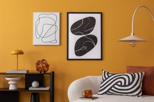
One of the most practical uses of large wall art is correcting a room that feels visually incomplete. Living rooms frequently carry most of their furniture weight in the lower half of the space, leaving a broad area of empty wall above sofas, consoles, and chairs. A sufficiently large artwork raises the visual center of gravity and makes the architecture feel more fully occupied. This is especially important in rooms with ceilings above the standard height, where conventional artwork can appear disproportionately small. Vertical compositions can emphasize height, while wide works can make narrow rooms feel more expansive. Art becomes a tool for adjusting perceived proportions without structural renovation.
Large artwork can also compete with architectural features that would otherwise dominate the room. A fireplace, television, broad window, or built-in shelving unit often attracts immediate attention because of its size. Placing substantial artwork elsewhere gives the eye a second major focal point, creating a more balanced visual hierarchy. This can be especially useful in rooms where the television occupies a prominent black rectangle when switched off. A large, expressive work on an adjacent or opposite wall gives the room an identity that is not centered exclusively on electronics. The result can feel more residential, intentional, and complete.
Asymmetrical rooms often benefit from this corrective effect as well. A living area may have a window on one side, an opening on another, and furniture arranged according to circulation rather than architectural symmetry. Trying to force perfect symmetry into such a room usually exposes the irregularities instead of solving them. Large art can establish a new visual anchor around which the rest of the furnishings appear organized. An intentionally off-center composition may even look more sophisticated when balanced by a tall floor lamp, plant, or sculptural chair. The aim is not to disguise the room's architecture, but to give uneven elements a convincing visual counterweight.
 Buy for Longevity Rather Than a Temporary Trend
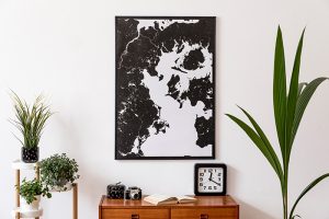
Because large wall art commands attention and usually represents a more significant purchase than small decorative pieces, it should ideally survive more than one decorating cycle. Trend-driven imagery can look fresh when it appears repeatedly on social media, but ubiquity can quickly reduce its sense of individuality. Personal connection is a more durable criterion than popularity. An image associated with travel, nature, architecture, cultural interests, or a particular artistic movement is more likely to remain meaningful as furniture and accessories change. Strong artwork does not need to match every future sofa, but it should have enough visual complexity to coexist with more than one palette. Buying with a five-year perspective often leads to better decisions than decorating for the current season.
Versatility also matters when choosing dimensions and orientation. Extremely specialized shapes can be impressive in a particular location but difficult to relocate if the room is redesigned. A moderately wide landscape format may work above a sofa today and above a console or dining cabinet later. Large square pieces can be surprisingly flexible because they are not tied strongly to either vertical or horizontal architecture. Neutral frames and adaptable materials can further extend an artwork's usefulness through future changes in paint colors and furniture. Considering possible second locations before buying can help distinguish a lasting investment from a piece that solves only one temporary design problem.
The final decision should still make room for instinct because art is not merely a proportional exercise. Measurements, palettes, materials, and decorating styles help eliminate poor choices, but they cannot determine which image will continue to reward attention. Large artwork is encountered repeatedly, often every day, and that familiarity makes emotional durability important. A piece that creates curiosity, calm, pleasure, recognition, or even productive tension can become part of how a room is experienced over time. The strongest choice will satisfy both the practical demands of the living room and the personal standards of the people who occupy it. When those two considerations align, large wall art stops functioning as filler and becomes one of the defining elements of the home.


